Using training wheels to learn bike riding is officially passé. Ryan McFarland closed the training wheel coffin with his 2007 invention of the Strider, a bike without pedals, brakes, or a chain that children ride Fred Flintstone-style. This innovation, where key bicycle parts are removed, is a demonstrably better way for young children to learn to ride. A recent Washington Post article (April 15, 2021) begins with the Strider bike as a counterintuitive analogy of the human inclination to add on instead of subtracting. This “less is more” approach appeals to minimalists and anyone committed to simplicity in software design.
In his 2021 book, Subtract: The Untapped Science of Less, University of Virginia Professor Leidy Klotz coins the term “More-ality” to put a name to the human bias of piling on instead of removing. He noticed this behavioral tendency in himself when he built a Lego bridge with his five-year-old son. They each built the pillars and when they added the flat part of the bridge, it was unsteady because the pillars were of different heights. As Klotz turned around to find another Lego brick to even the pillars, his son removed bricks from the taller ones making them all the same height.
Klotz’s research in subtraction is fueled in part by his real-world concern about climate change. In a 2021 interview, Klotz put it succinctly, stating, “So infinite growth on a finite planet is impossible.”
It’s tempting to extrapolate from the ingenuity of the Strider bike or the limitations of the Earth’s resources that the principle of “less is more” applies to everything. Take software. Software products may become more intuitive and user-friendly when interfaces are simplified, but the injudicious subtraction of features and functionality may disserve power users.
Any parent who has grumbled about reinstalling training wheels removed too early knows they don’t fully equip a learner with all the requisite skills to ride a bike unaided. Software teams often build guardrails into their products to prevent novices from making devastating mistakes. The problem with these software failsafes, like actual training wheels, is that they are often cumbersome to disable and enable. Consequently, experienced users may face needless protection or novice users may lack adequate limitations. Product analytics tools like Pendo may guide new features but are more a hey, look what you can do now notification and less a gauge of users’ experience levels.

The analogy of the Strider bike is better viewed as the challenge of learning versus doing. A learner’s needs differ from those of an experienced user. The Strider bike is a great example of a product for learning alone. When a child has mastered balancing on two wheels, it’s time to introduce a real bike, pedals, chain, and all.
Does this mean that development teams should build separate products for learners and experienced users? Not necessarily. A beginner reaps myriad benefits by learning on the same product they will use upon gaining experience. However, a full array of features required by experienced users may unnecessarily intimidate novices.
Imagine an elderly person who buys her first iPhone wanting to learn to text her grandchildren. The first thing she’ll discover is the need to enter her grandchildrens’ contact information. She will face the well-designed but daunting iPhone Contact screen. Not to start a war with Apple’s UX team, but their Contact screen is long and mandatory fields aren’t highlighted.

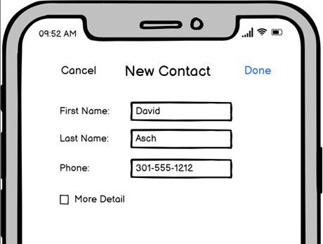
Since the grandmother’s goal is to text with her grandchildren, the following screen provides a less cluttered way to enter the minimum required information, akin to a Strider bike for someone new to the phone. When the grandmother masters entering simple contacts and texting, she may elect to enable the full-featured contact screen above and enter additional useful but optional information.

The “less is more” philosophy is generally a great approach for those just starting. Although minimalists espouse spare design for experienced users, sometimes a redesign to make it simpler results in a confusing user experience.
Here’s a case in point. Spotify recently released a new desktop version that simplifies its user interface. Initially, I applauded Spotify’s decision to subtract from their UI instead of adding more. Then I made a disconcerting discovery.
I maintain a monster playlist that grows as I find new music to add.

Artists often have multiple versions of the same song — different cuts, live versions, remastered versions. To avoid duplication in my playlist, I wanted to sort it by Artist and verify that the playlist doesn’t contain the same song by the same artist with slightly different names. The screen capture above is missing the ‘Artist’ column, which was present in the previous version. The screen looks nice and uncluttered, but I couldn’t figure out how to accomplish my task. I noticed that the artist’s name appears below the song title in the ‘Title’ column. Then I noticed the ‘Custom order’ dropdown on the right-hand side of the page.

Selecting the ‘Artist’ item in the Custom order dropdown menu transformed the page to change the ‘Title’ column to the ‘Artist’ column and alphabetize the playlist by Artist name.

Technically, this solution works and looks cleaner, but it’s needlessly confusing for users. Is it really beneficial to toggle the definition of a column and confound users just to provide an uncluttered table? No, it’s not. Saving space by making a column dual-purpose introduces unnecessary cognitive load.
This Spotify “simplification” is analogous to experienced bicyclists who opt for fixies (fixed-gear bicycles usually missing handbrakes). Fixies have a spare, clean silhouette owing to the absence of a derailleur, brakes, a multi-sprocket rear cassette, and cables. Although fixies look beautiful and stylish, a rider’s experience is severely compromised when she needs to scale a massive hill with no gears.

Feature subtraction is a marvelous idea for users learning new applications. When accompanied by great design, a minimalist aesthetic may even yield substantial benefits for experienced users. However, inflicting cognitive overload for the sake of spare design yields a bad user experience and should be avoided at all costs.
